Dr. Squatch Soap Co.
Art Direction, Brand Identity, TypographyChallenge
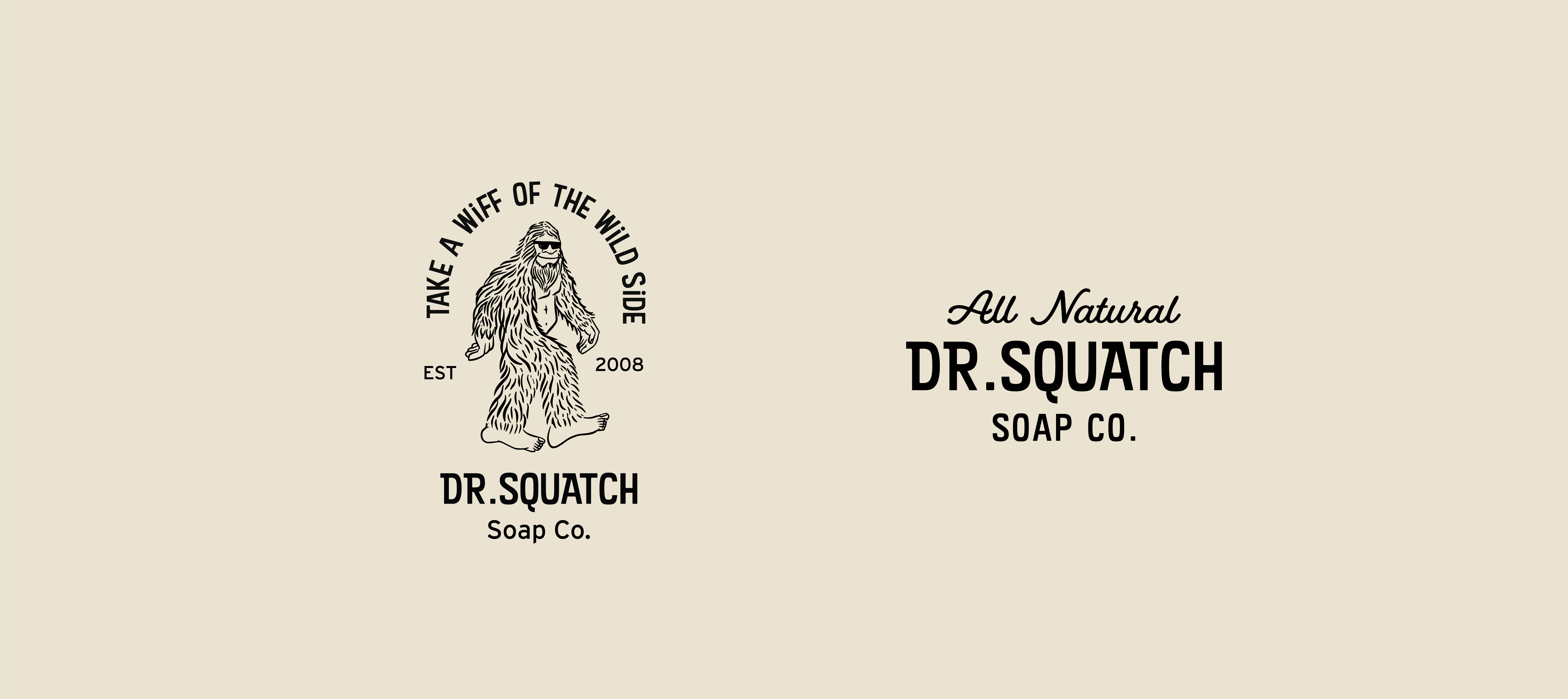
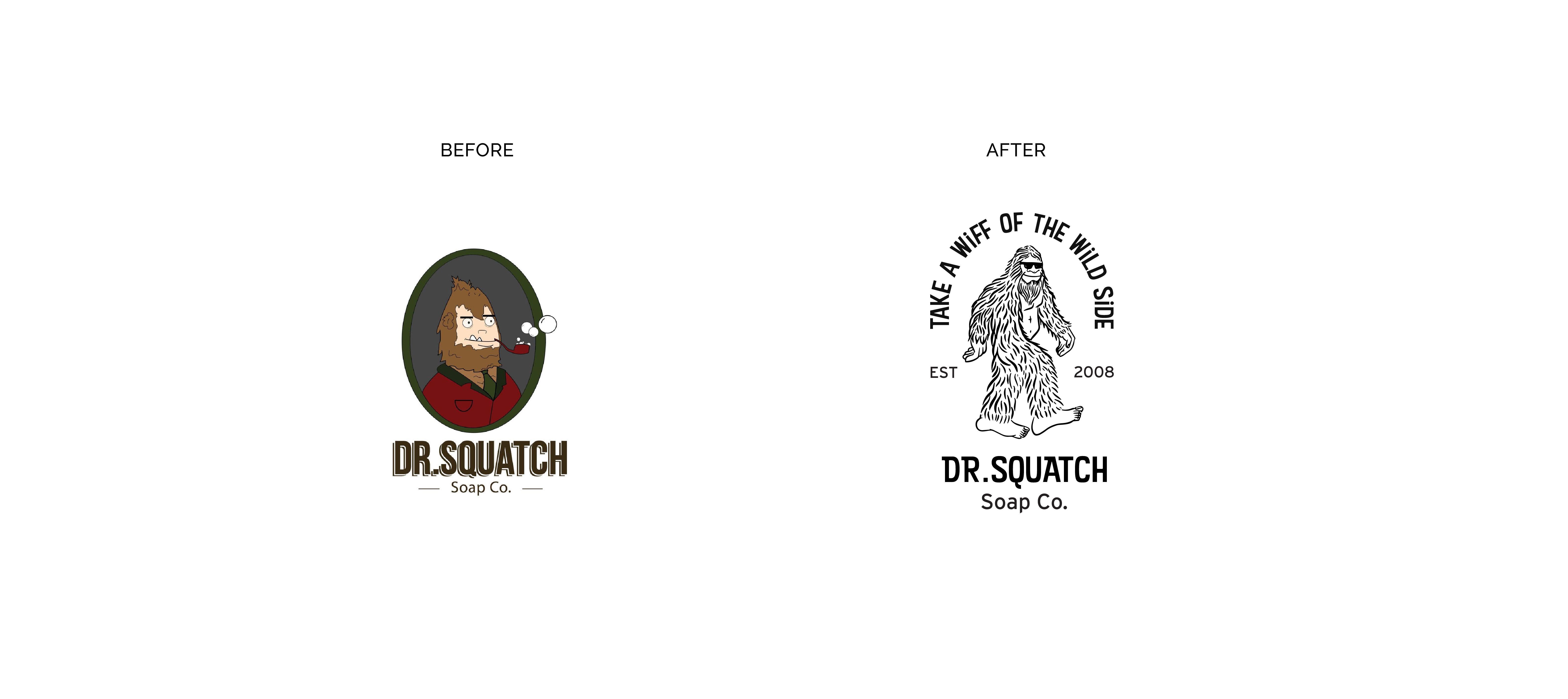
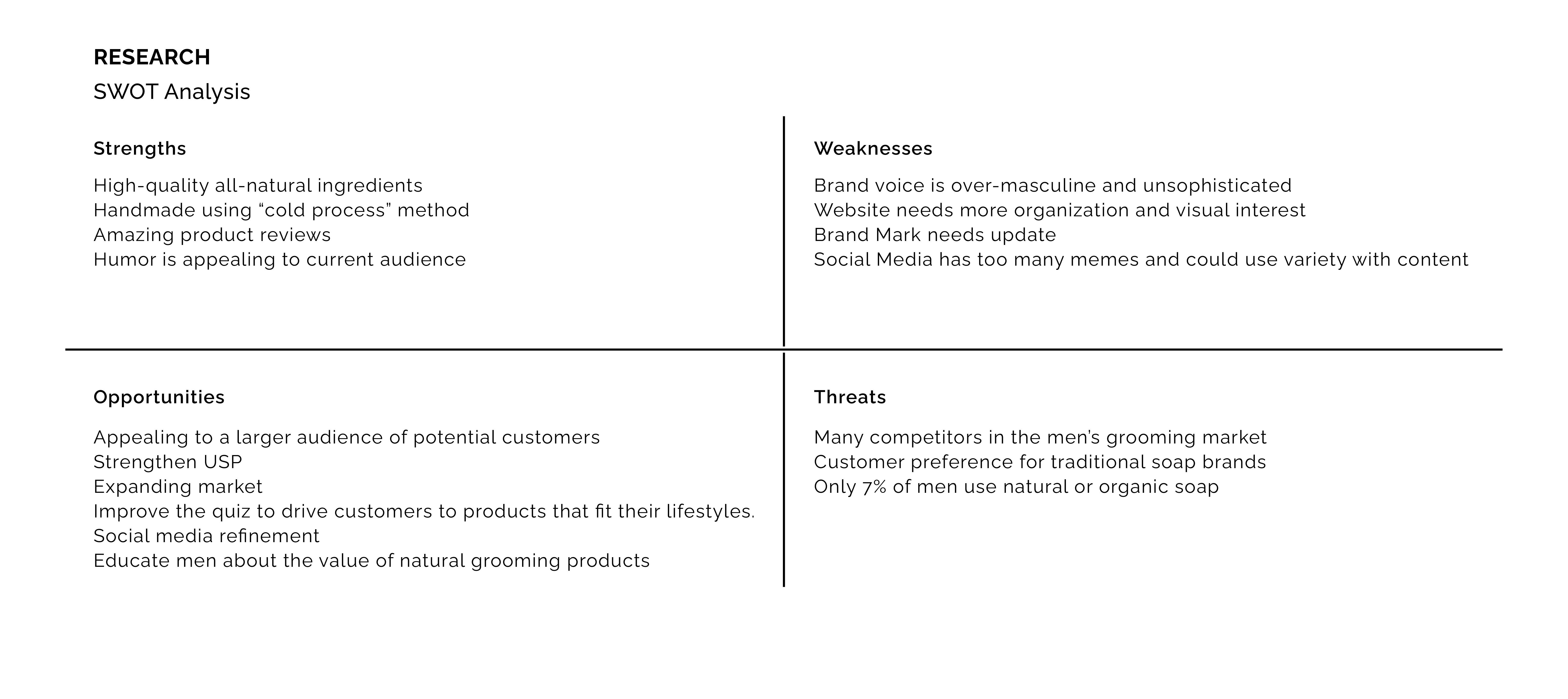
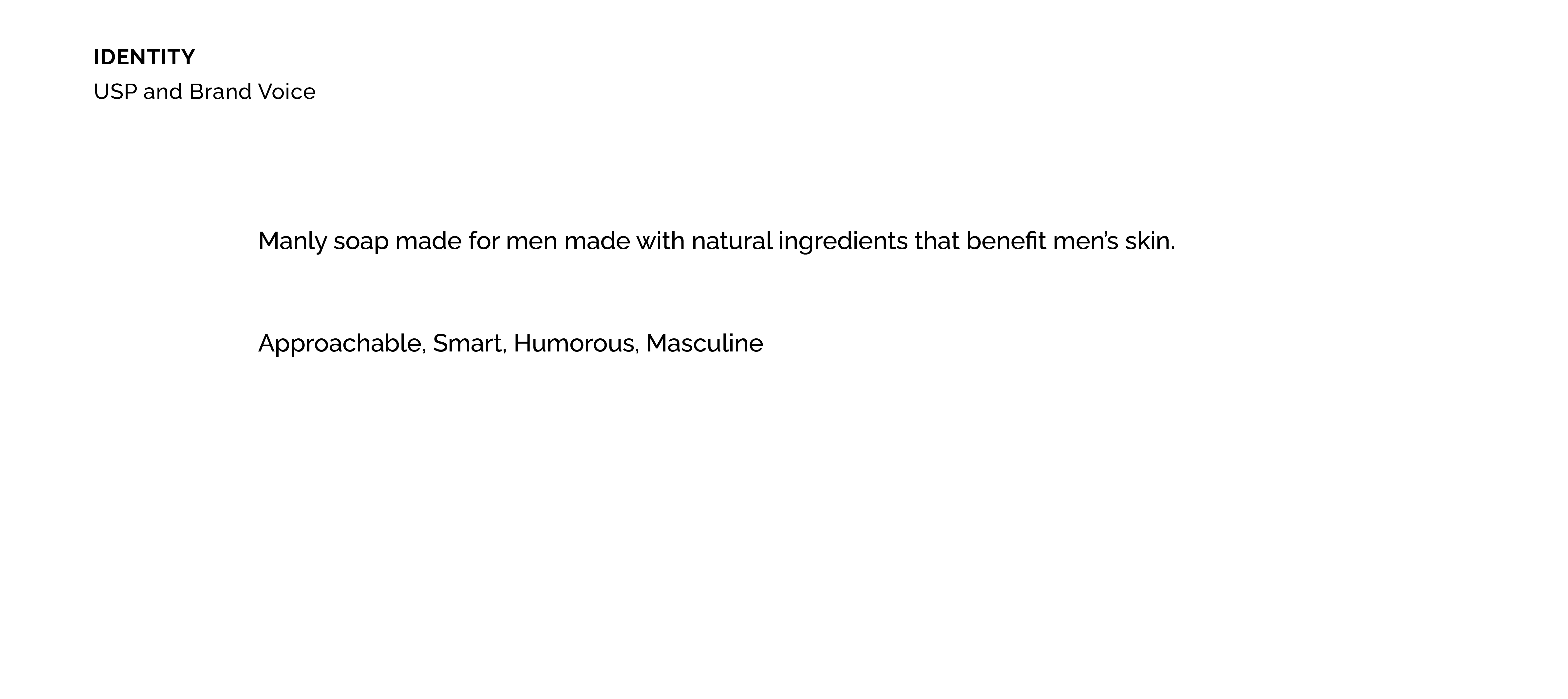
Dr. Squatch is an all-natural, all-American company that makes soap and grooming products that are designed by men for men. Dr. Squatch wants to change the way men approach personal grooming by providing healthy, all natural products that allow you to feel like a man and smell like a champion. Dr. Squatch’s biggest consumer is rural blue collar men who wouldn’t normally buy natural products. Their current branding fails to speak to men of a larger audience.Solution
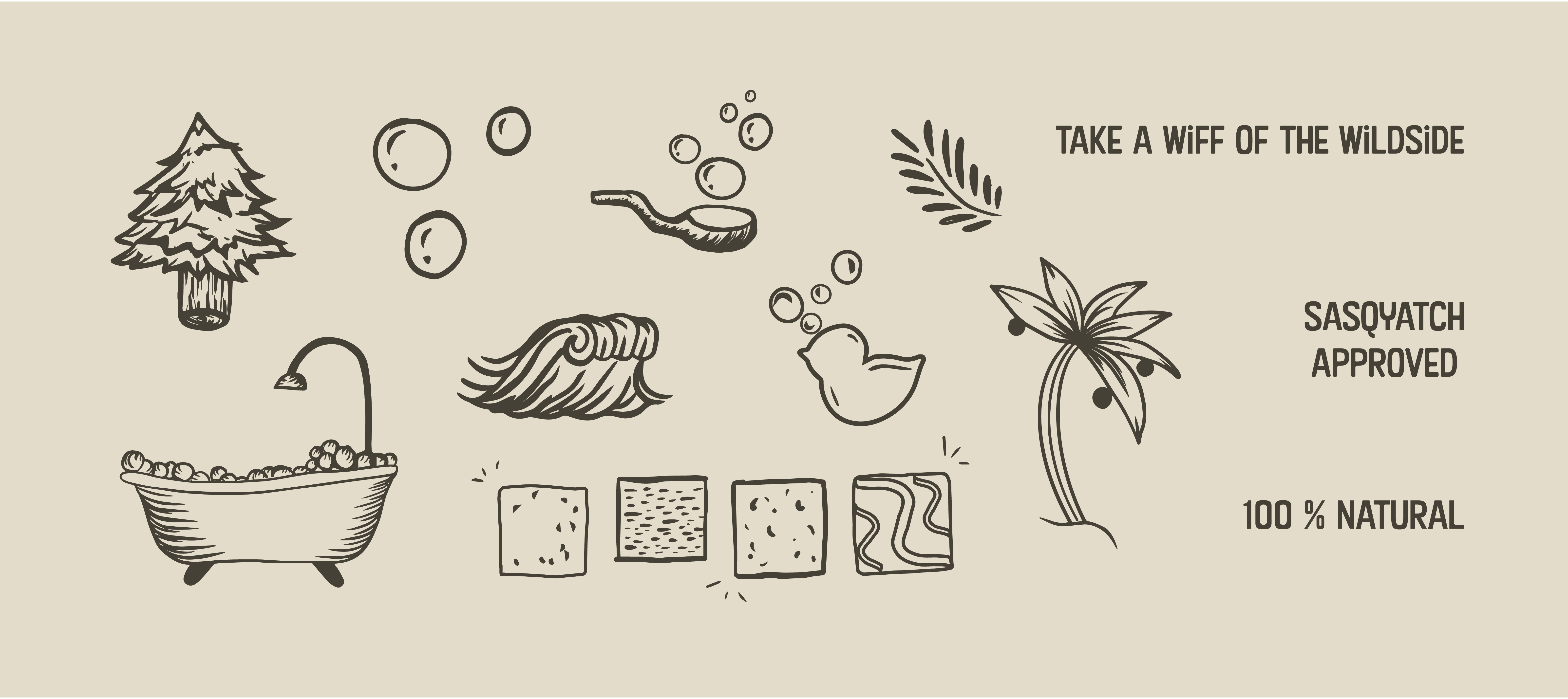
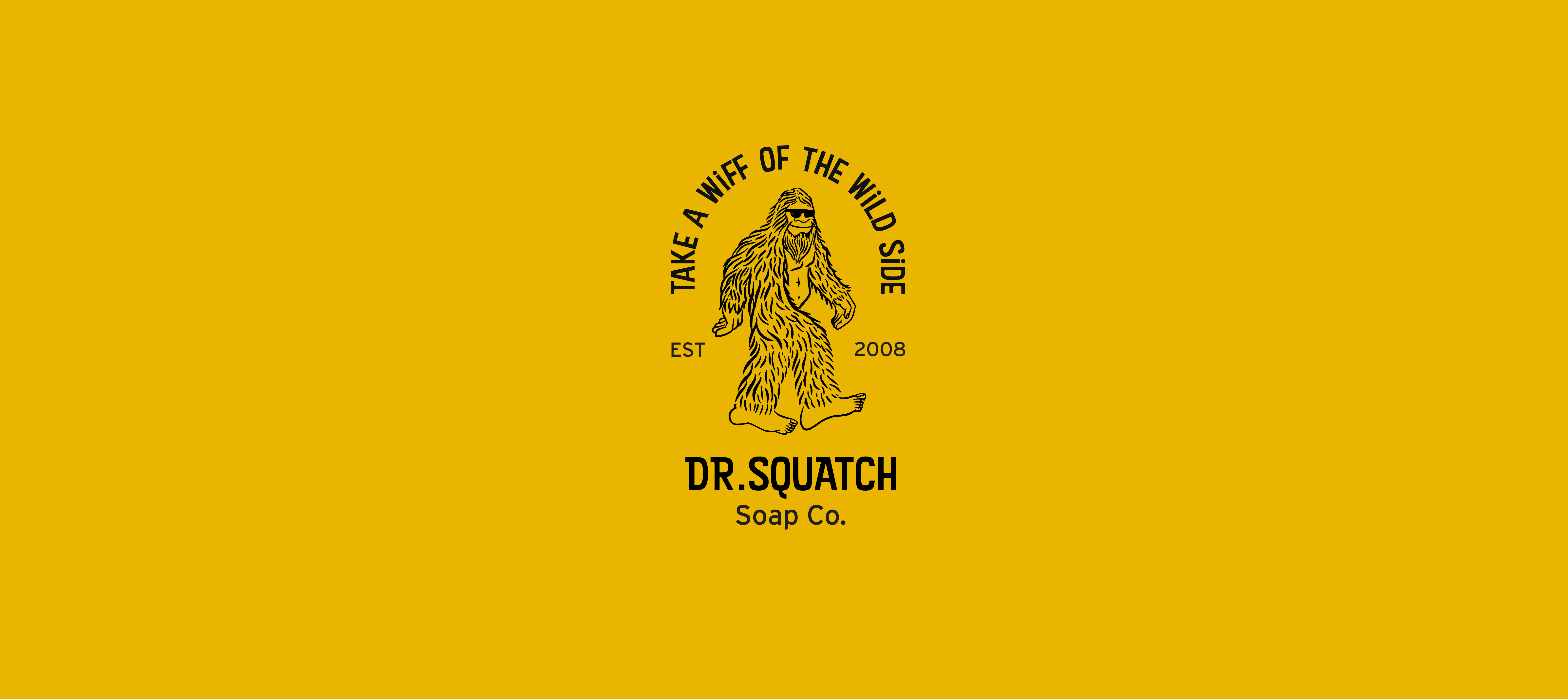
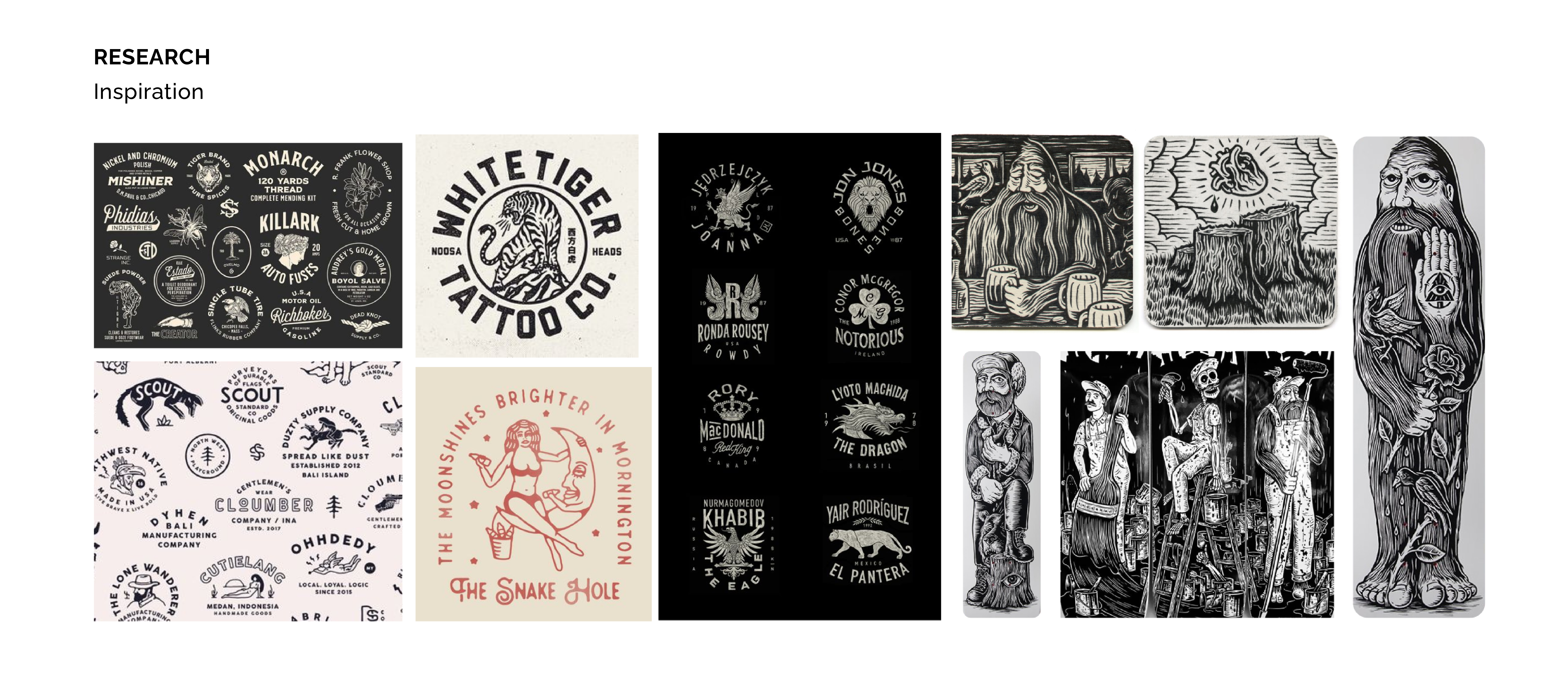
We were able to understand the brands current market and customer by conducting extensive secondary research. Our findings brought us to the conclusion that the brand had an opportunity to expand their target audience. In order to capture a more diverse demographic of males we amplified their strengths by utilizing approachable type, natural colors, and mainstream humor.Art Direction/ Strategy: Rachel Arthur, Rudy Flores, Gabe Salas, Jacquie Tiznado
Advertisement/Copywriting: Rachel Arthur, Rudy Flores, Gabe Salas
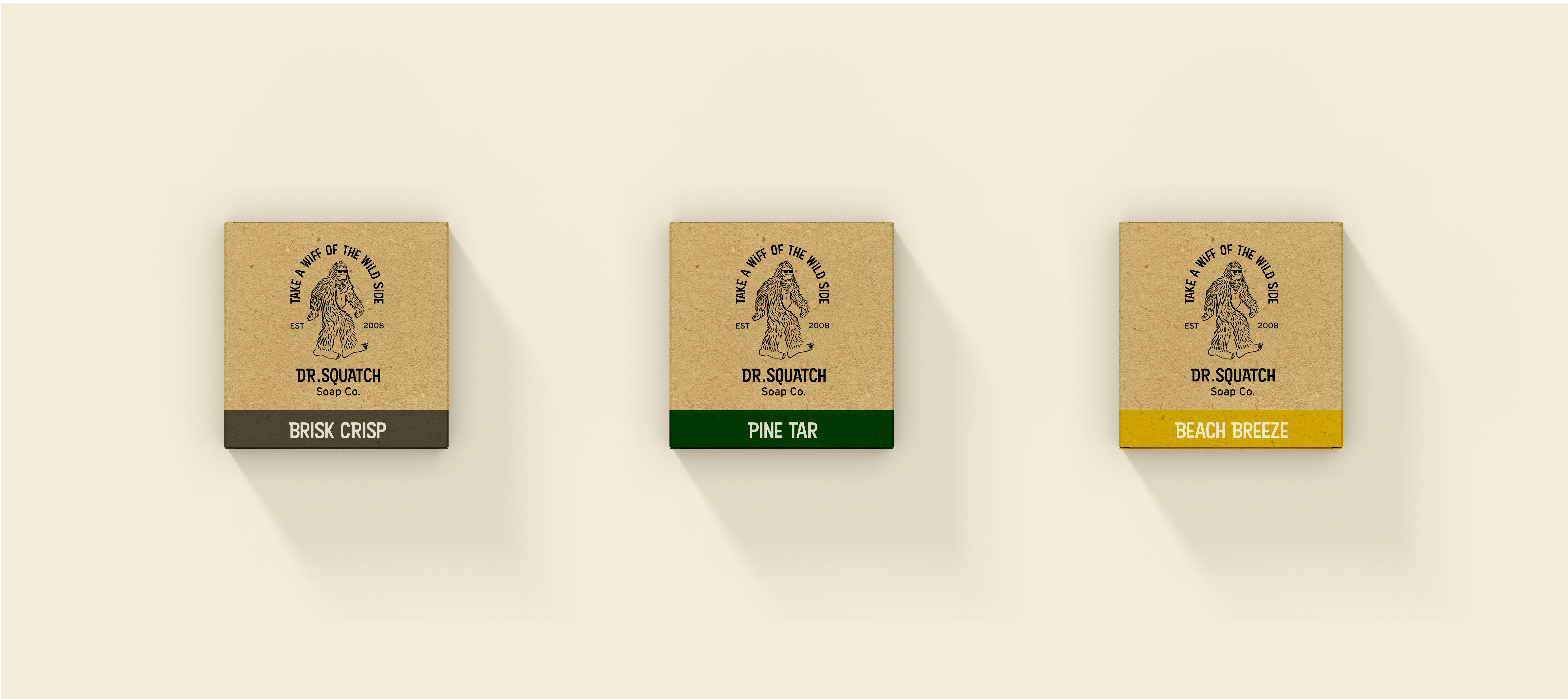
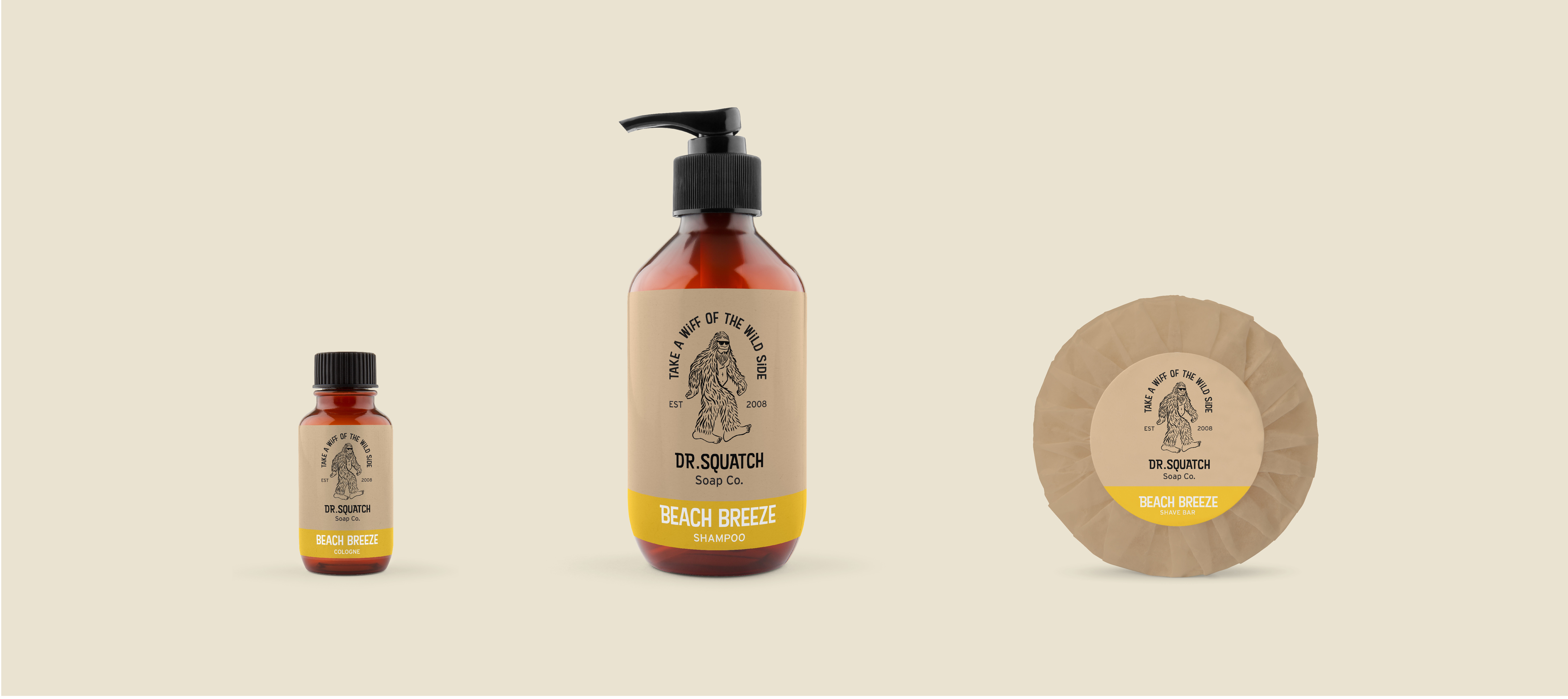
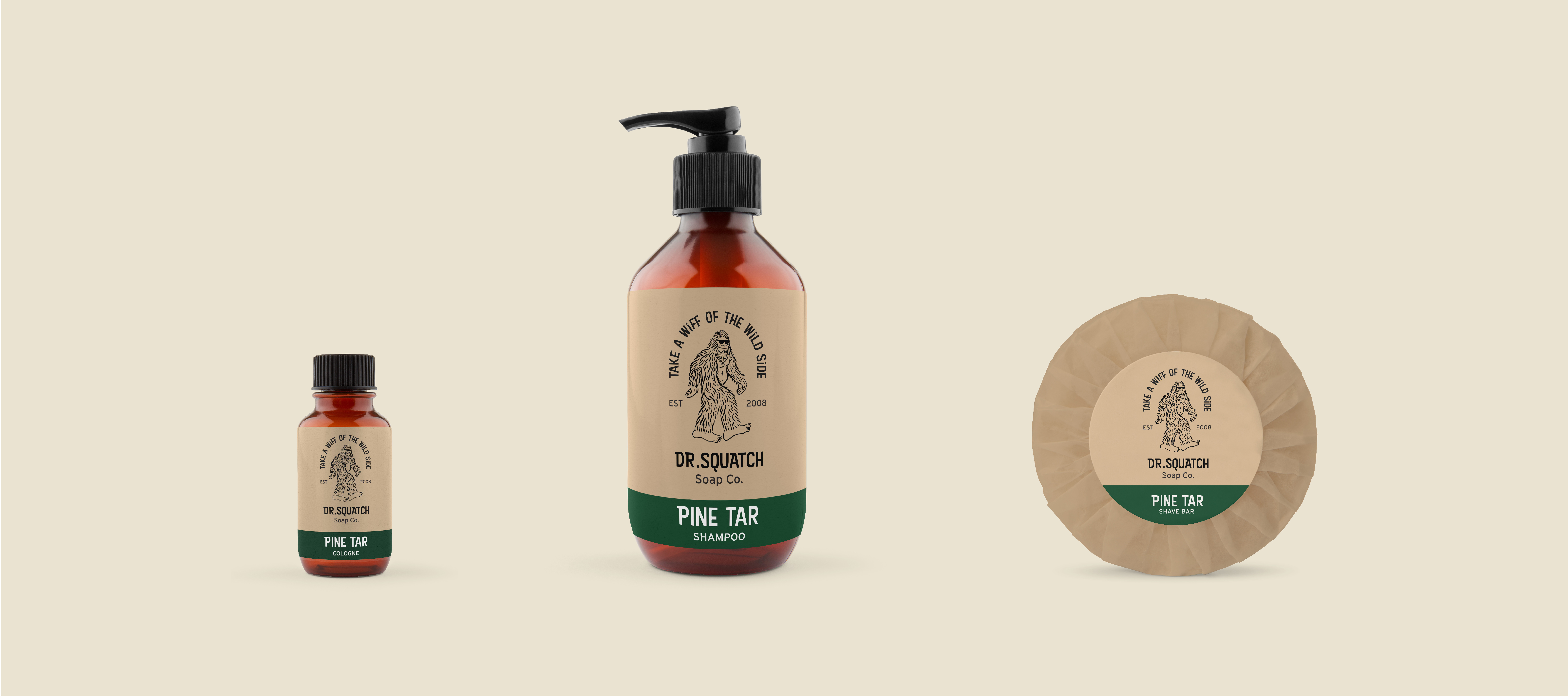
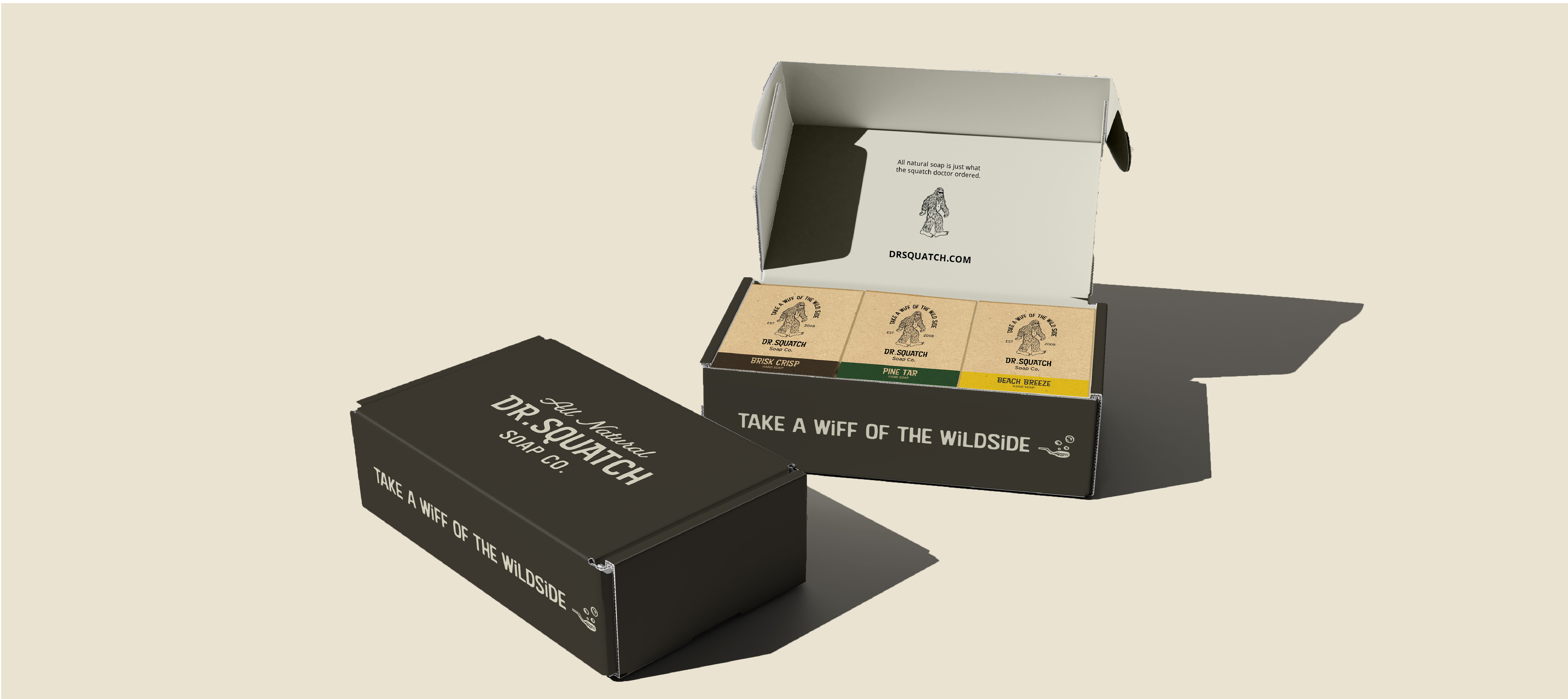
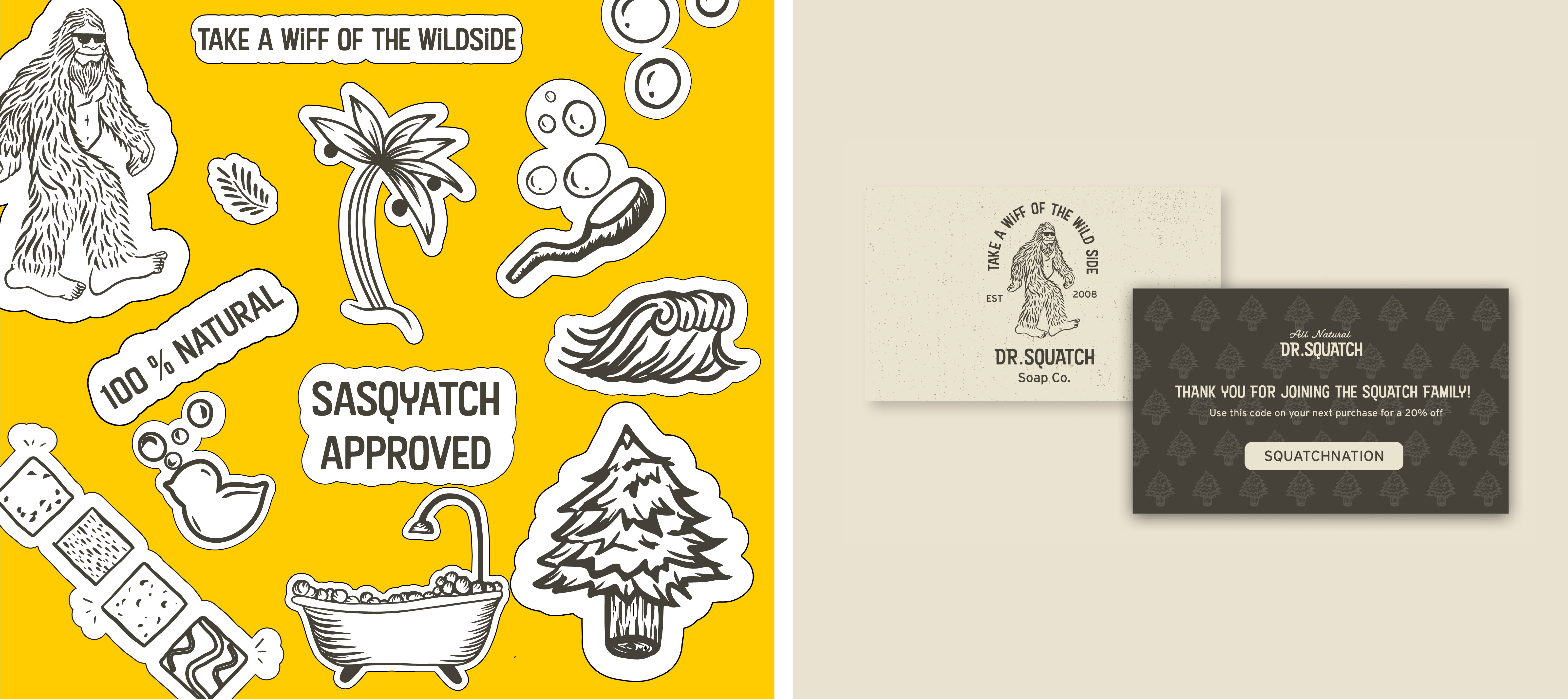
Packaging Design: Gabe Salas, Jacquie Tiznado
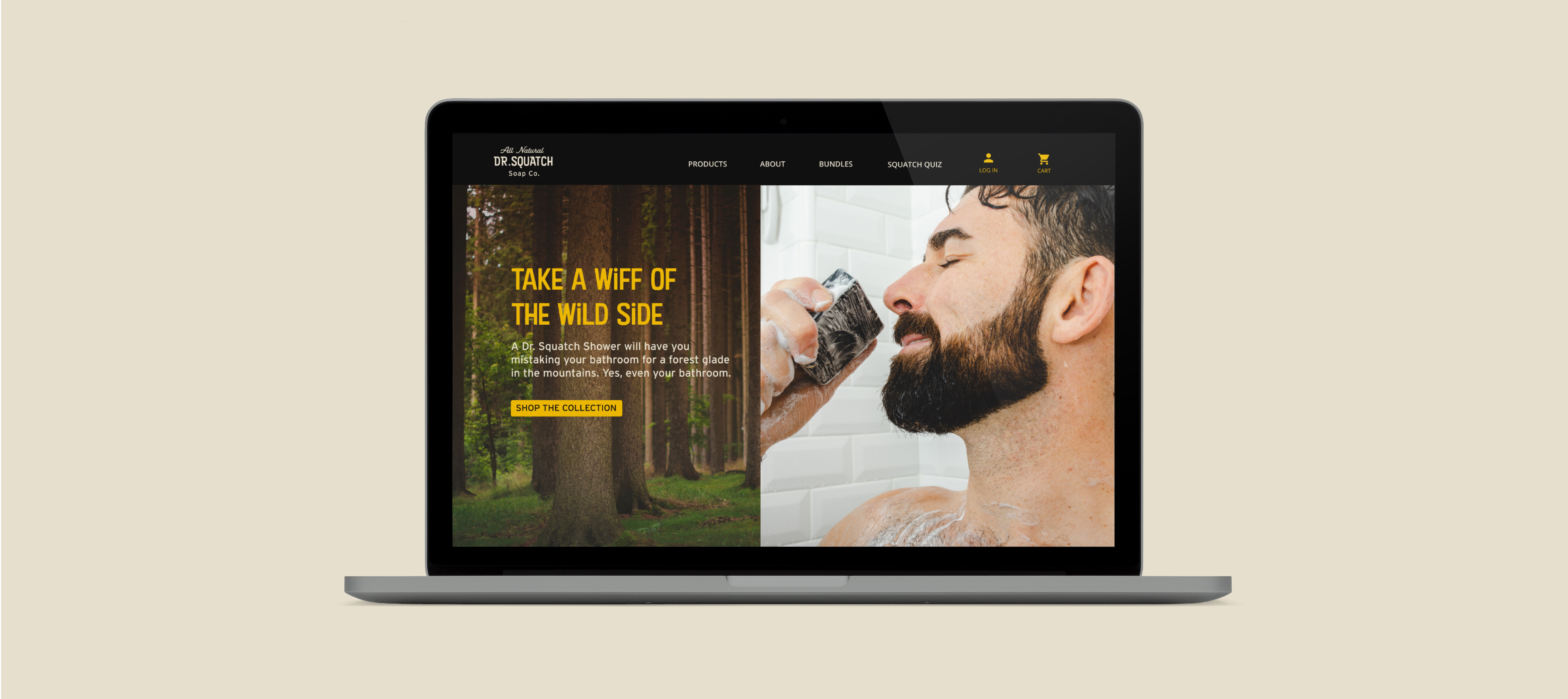
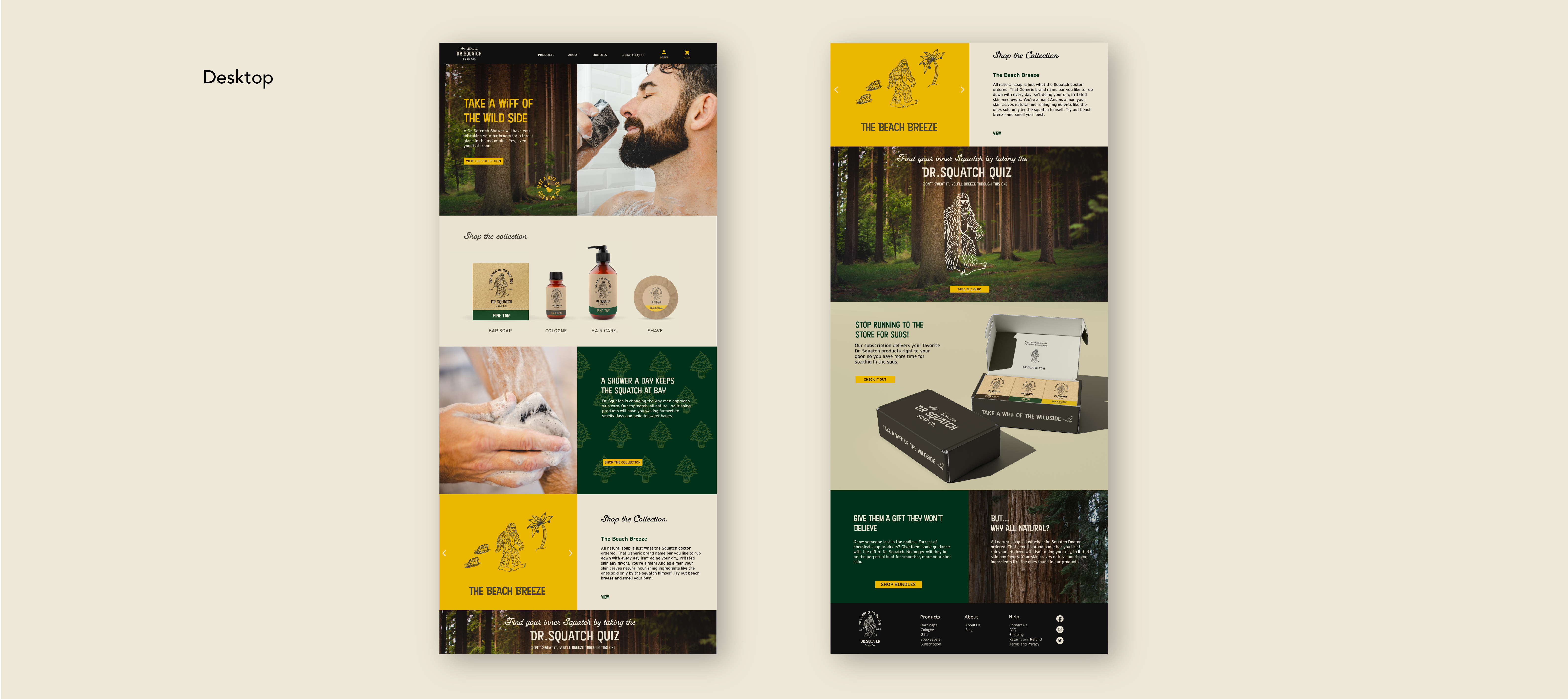
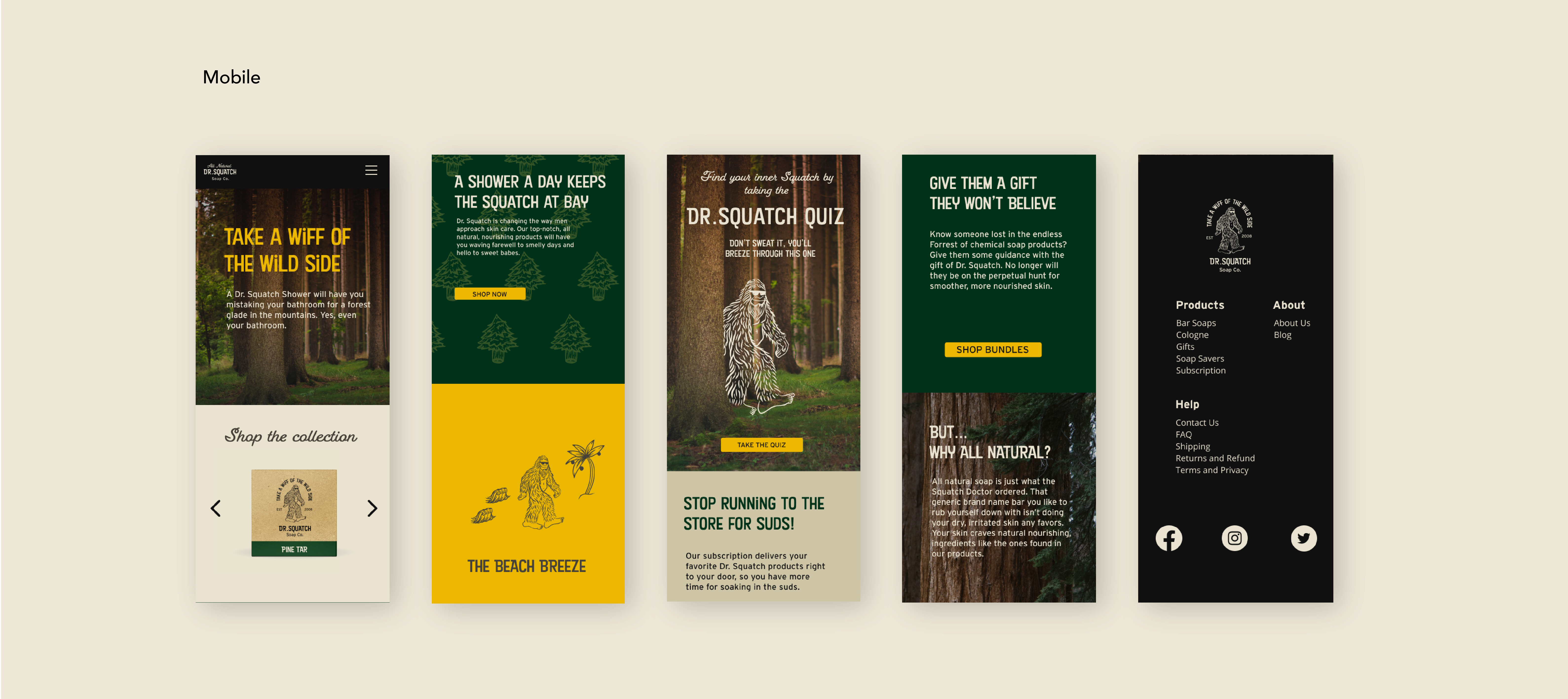
Website Design: Rachel Arthur, Rudy Flores, Gabe Salas
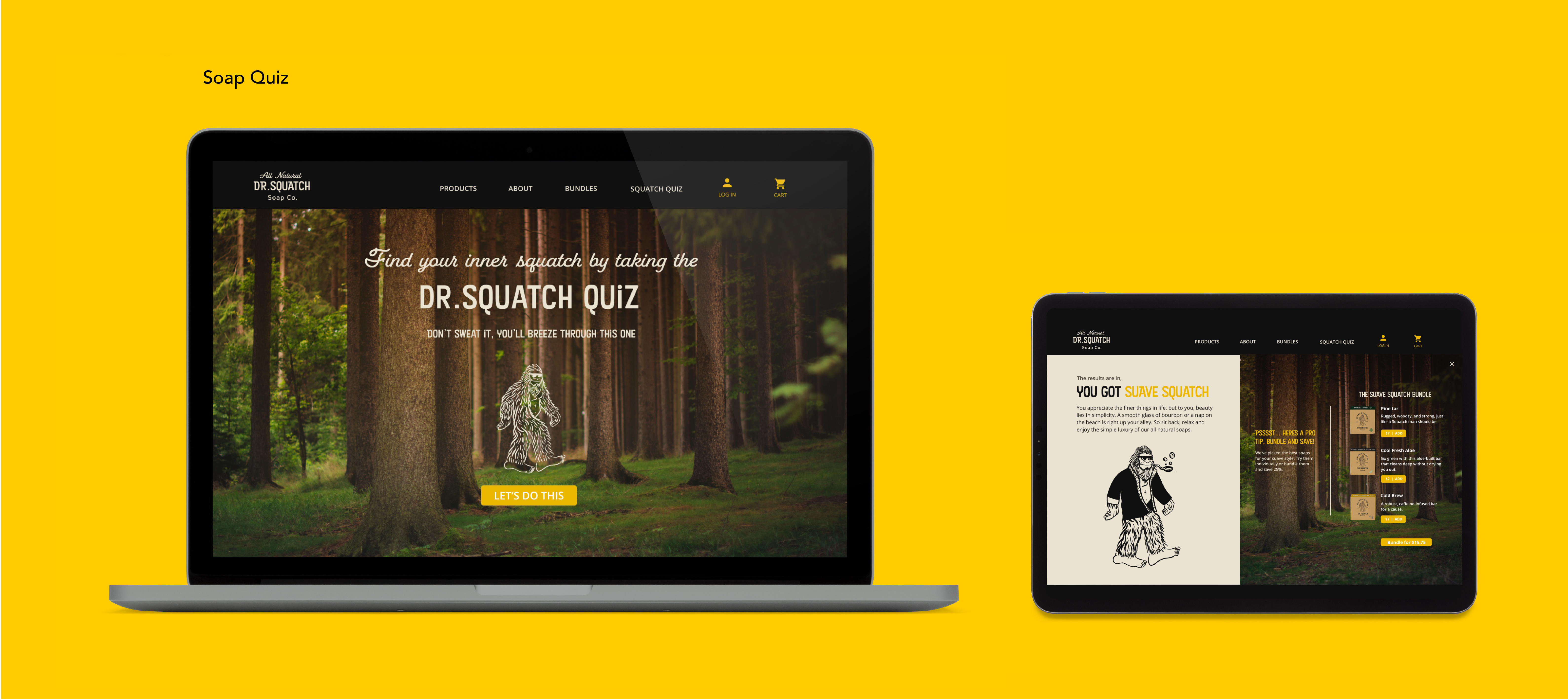
Soap Subscription Quiz: Rachel Arthur, Rudy Flores
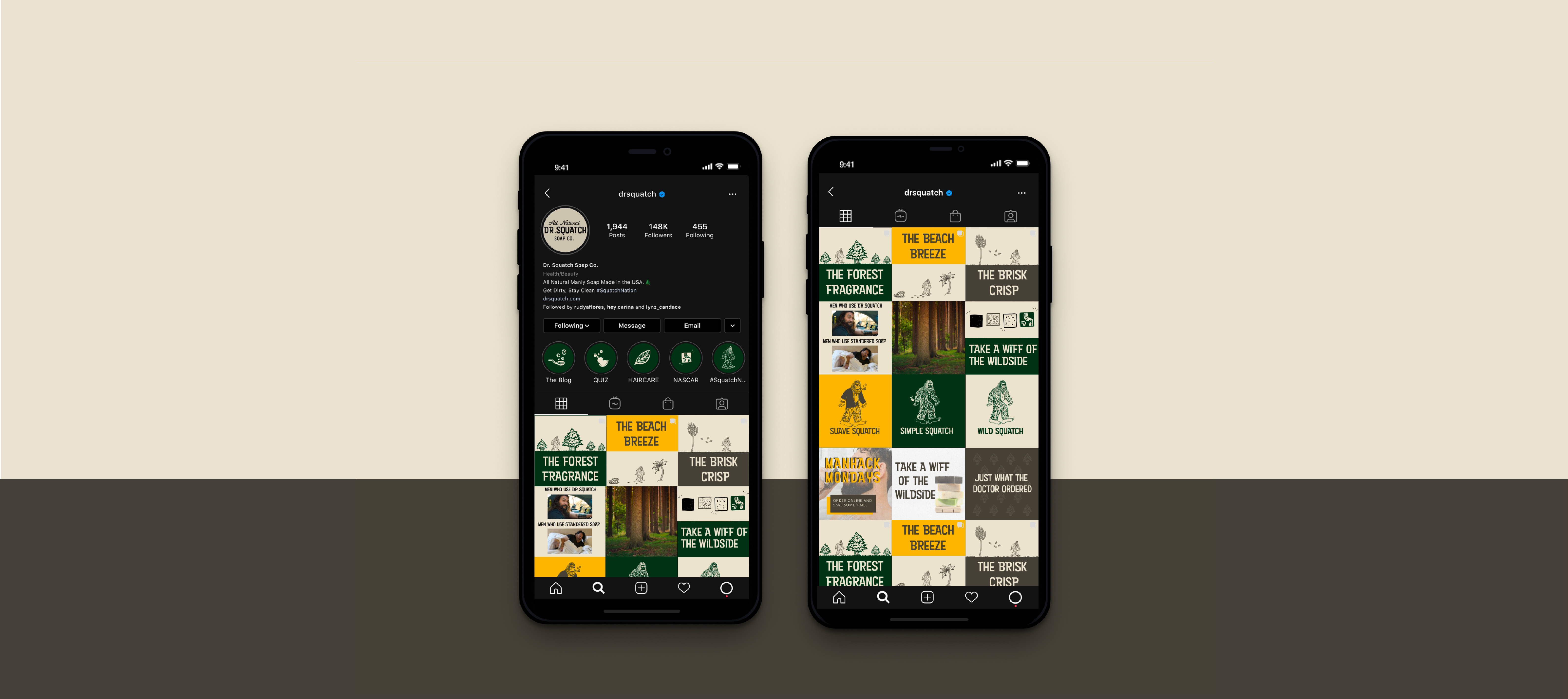
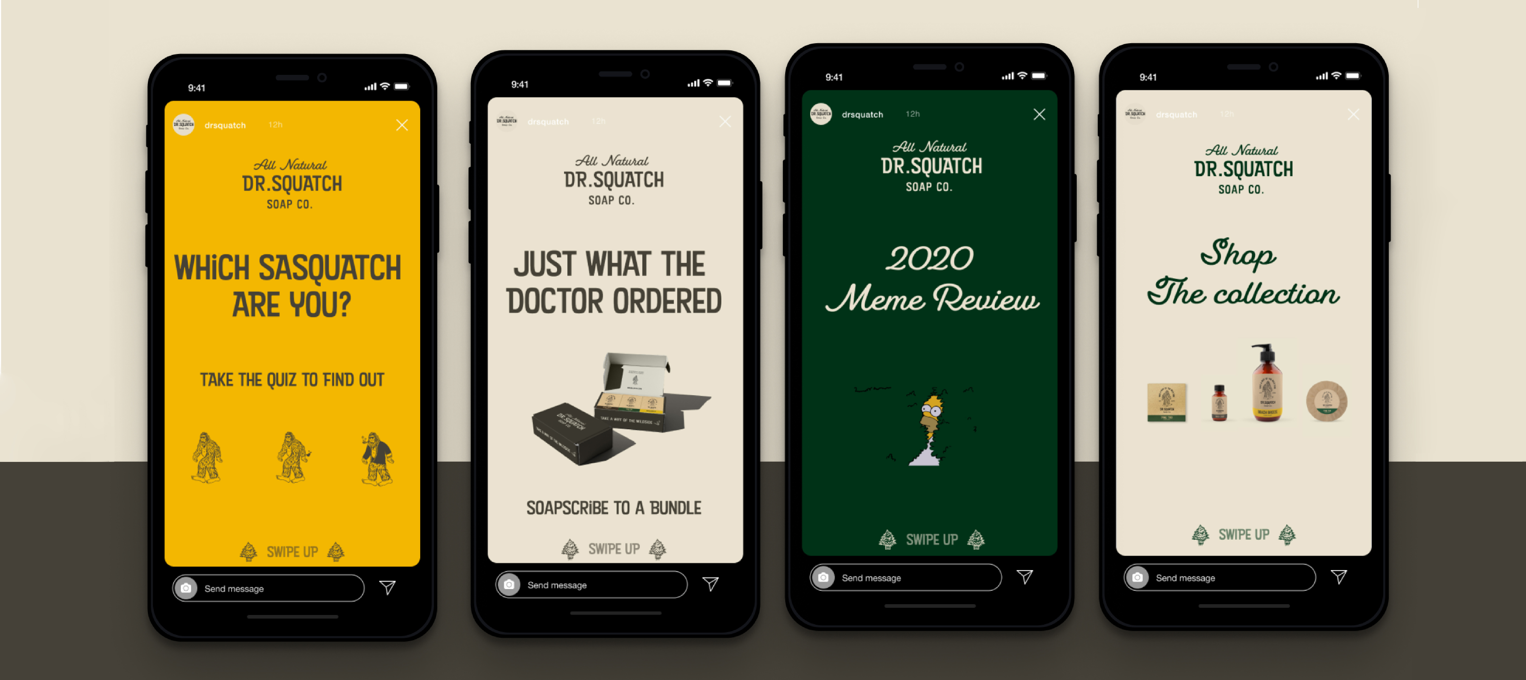
Social Media: Gabe Salas
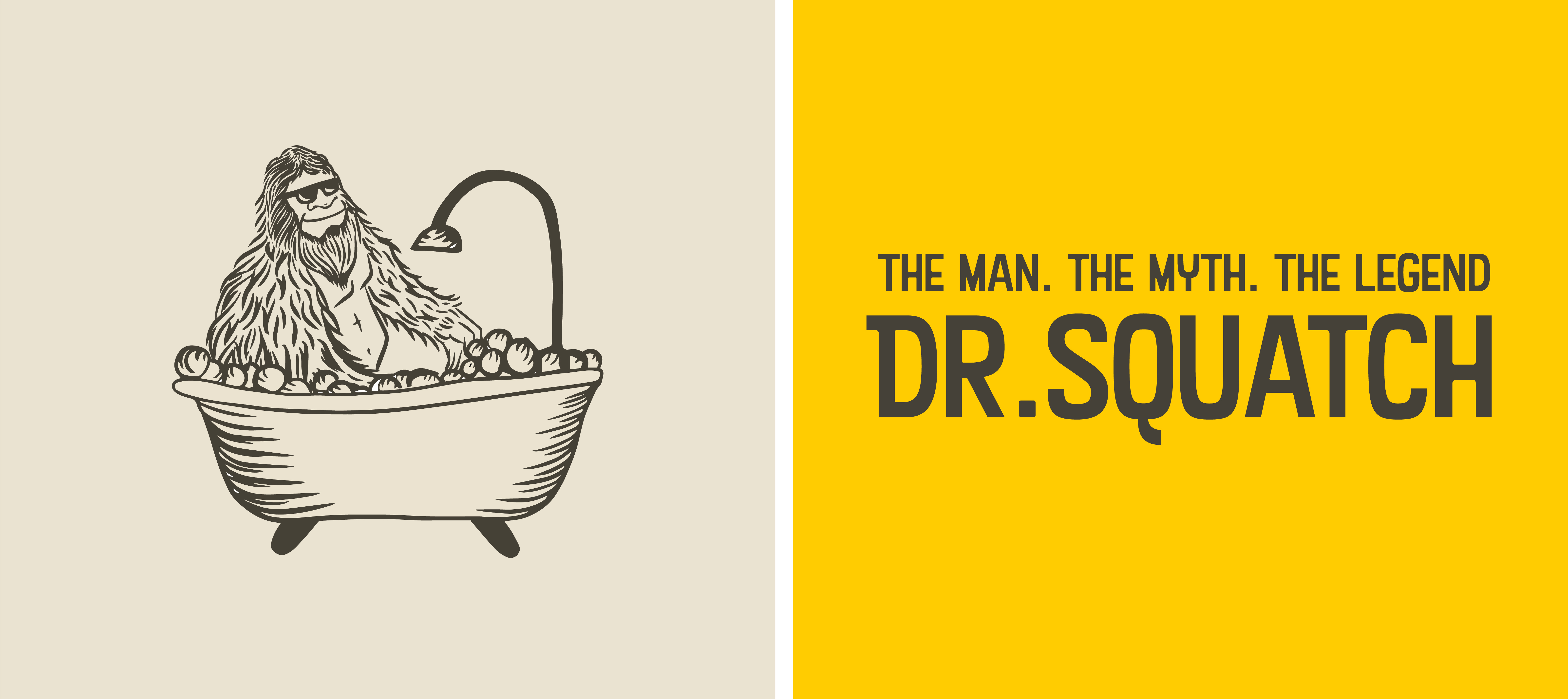
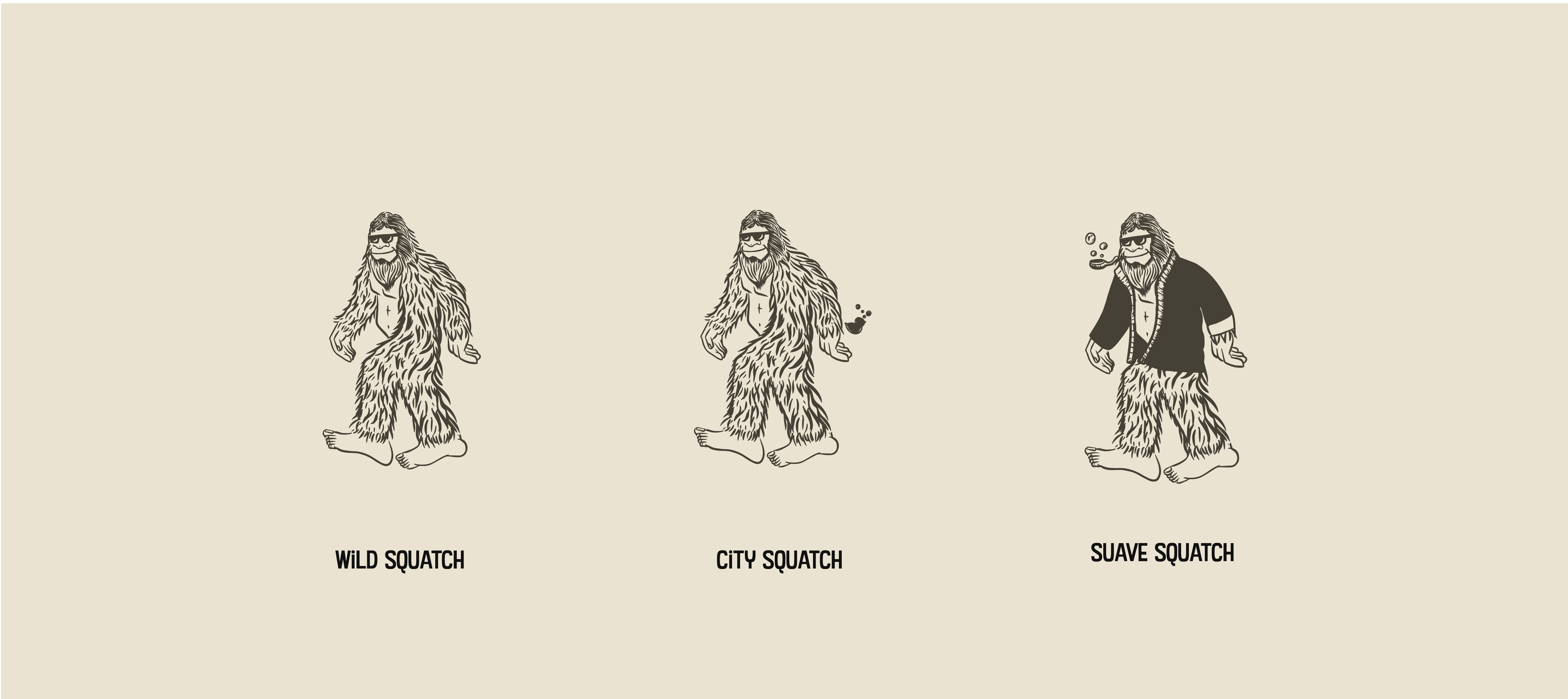
Illustrations: Rudy Flores